Let There Be…Grey.
Oh Seattle. Â I am ever-so-happy I moved to your fine city. Â I’ve loved renovating my home and I cherish the friends I’ve made here, but come February I yearn for sun. Â Hot, bright, piercing sunshine. Â Sadly, I won’t see the sun until May. Â In the meantime, I try and surround myself with ‘sunny’ surroundings. Â I love bright colors. Â Just looking at the bright oranges and yellows brightens my mood, to say nothing of the mossy greens.
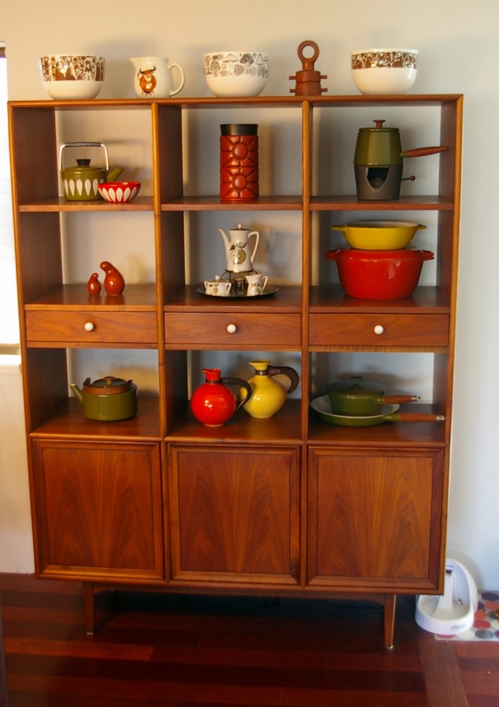
Our Drexel Declaration wall unit is constantly changing. Â Pieces come in-and-out as we sell them on the shop, but many pieces stay around for my personal collection, especially my Finel bowls!
A Dreamy Little Hedgehog
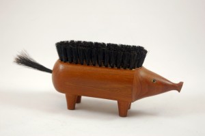
This weekend while we were out thrifting, the husband ran up to me with a gleam in his eye. Â “Look what I found!” Â The thrifting gods have not been kind recently, so I looked down to his outstretched hand with hopeful eyes.
I have to admit I didn’t know what to think at first. Â I knew it was teak and I assumed it was made in Denmark, but I was only half right. Â This darling little hedgehog was made in Italy, probably in the 1960s? Â He reminds me of Kay Bojesen’s lovely wooden animals as well as Walter Bosse’s hedgehog ashtrays.
Our little hog also has the dubious honor of being my fastest etsy sale to date. Â Good luck, little dude! Â Have fun in your new home!
New in the Shop
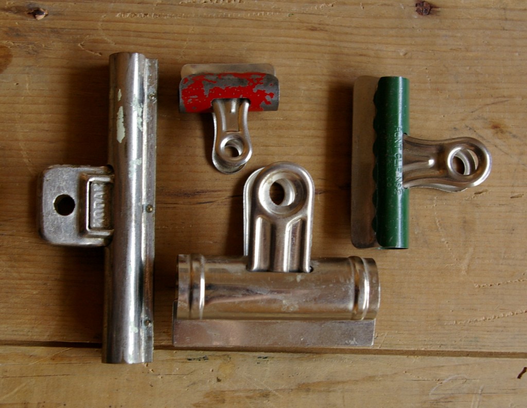
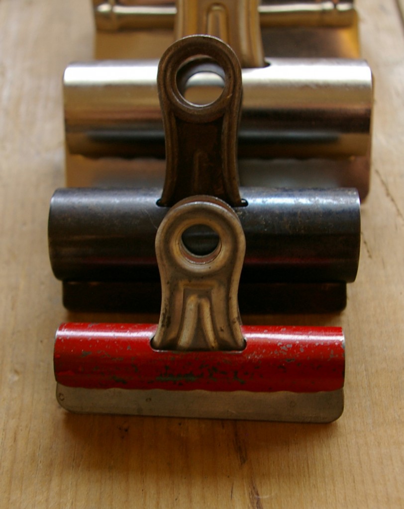
We were at an estate sale a few weekends ago that was a little overwhelming. Â The three daughters running the sale said it was the sixth-or-seventh weekend, but the entire house was still full of stuff. Â 50 wooden cutting boards, 30 phones, and tons of vintage office supplies. Â I saw a box full of old clips and picked out some of the best for the shop. Â Now I wish I had grabbed all of them: not only are they useful, they’re also photogenic!
The afternoon light in Seattle today was perfect for taking this sort of photo, especially with the glints of metal. Â I’ll be listing them in the shop during the next week or so!
It’s 12:20 on a Friday
The Library Congress has an amazing Flickr feed that includes so many beautiful historic photos. Â In particular, the Gottlieb Jazz Photos are making me swoon. Â The music practically pours out of the image and makes me think of my favorite Frank O’Hara poem, “The Day Lady Died.”
The Day Lady Died
by Frank O’Hara
| It is 12:20 in New York a Friday three days after Bastille day, yes it is 1959 and I go get a shoeshine because I will get off the 4:19 in Easthampton at 7:15 and then go straight to dinner and I don’t know the people who will feed me I walk up the muggy street beginning to sun and for Mike I just stroll into the PARK LANE and I am sweating a lot by now and thinking of |
The Tracy House
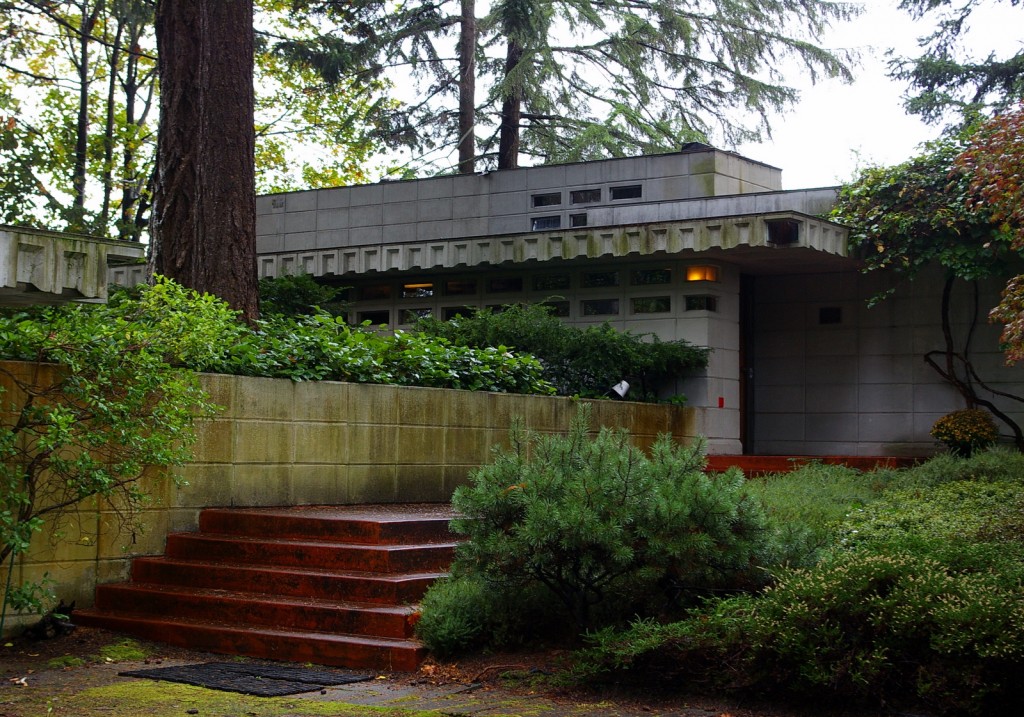
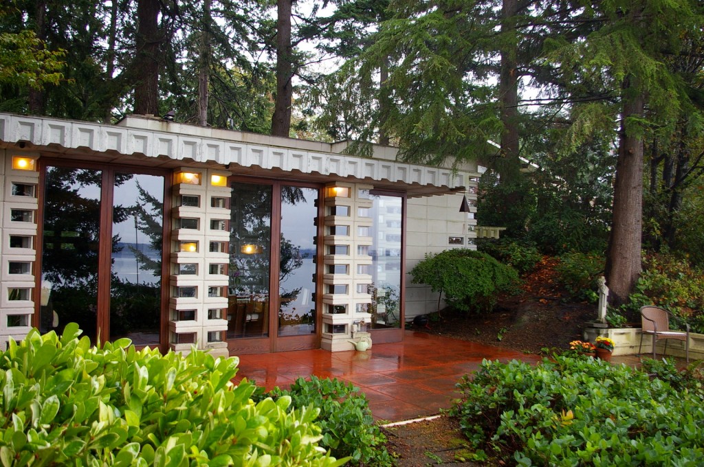
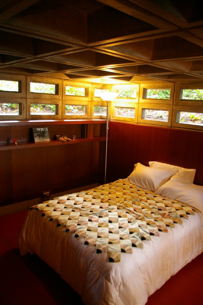
On Friday evening a very frantic Kevin called me about a chance to have a tour of the Tracy House, one of three Frank Lloyd Wright houses in Washington and, of course, I jumped at the chance. Â The house, as it turns out, is only a 10 minute drive from our neighborhood in West Seattle, so after our Saturday morning estate sales, we hopped in the car and drove to Normandy Park, Washington.
Part of this house’s charm was it’s amazing ability to blend into the background. Â Concrete blocks peek around pine trees and ferns, suggesting that a beautiful house is just around the corner.
Given the size of the trees in front, I would bet that the house was built around them, which is very much in keeping with Wright’s attention to detail.  The green, red, and grey palate was another design element that ran through the entire property–as was the integration of the squares of concrete with the green vertical lines of the trees and the red horizontal lines of the stairs.  All this harmony made for a perfect blend of natural and man-made elements.
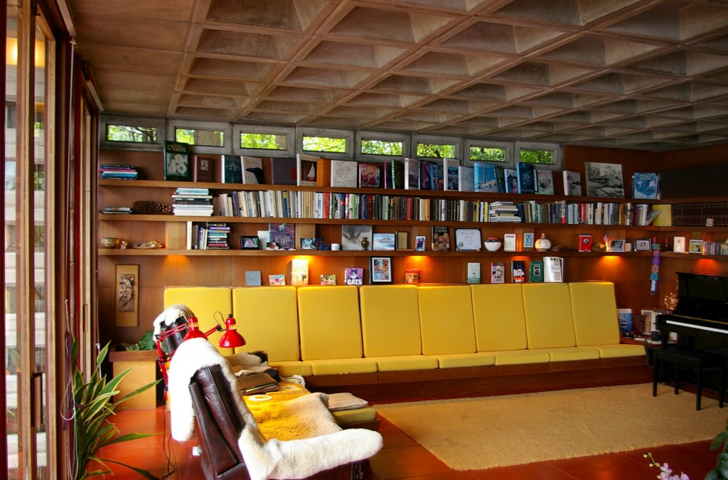
The Tracy’s commissioned the house in 1955 and knew they wanted to live there for the rest of their life. Â They saved money and laid the concrete bricks themselves to Wright’s specifications. Â According to our tour guide, they loved to sit in their chairs and read in the evenings, and I have to say, the living room was one of the most inviting I’ve seen. Â The built-in soda and redwood bookcases gave the room a cozy feeling.
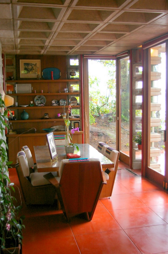
Like many of Frank Lloyd Wright’s houses, he also designed dining furniture, and the Tracy House is no exception. Â The long dining table fit perfectly into the dining space. Â It would be a perfect place to eat and watch the ocean below.
The concrete blocks formed the ceiling throughout the house, including in the three bedrooms. Â The bedrooms and hallway had very low ceilings, probably around 7 feet, maybe even less. Â Even though I could easily touch the ceiling in the bedrooms (I’m 6’1, so it wasn’t that hard!) the combination of the cool grey of the concrete and the warm red of the walls and floor really gave the space a cozy rather than claustrophobic feel.
It was a wonderful Saturday! Â The house will go up for sale soon, but sadly Kevin and I will not be on the list of buyers. Â It was, however, an amazing treat to be given free reign of the house for an hour! Â I think that we’ll definitely be visiting more Frank Lloyd Wright houses in the future!
And she’s back…
Here in Seattle, autumn is a fickle season.  Yesterday, it was beautifully sunny and I lounged on the porch with a beer, letting the sun warm my shoulders.  Today, it’s windy and dark and I’m curled up with a cup of Noël à Vienne tea and a blanket.  I’m feeling a bit fickle too now that my dissertation is complete and I’ll be filing soon.  My etsy shop has taken over a large chuck of my time, so much so that my blogging completely fell to the wayside.  In fact, the shop just had its 100th sale, if you can believe it!
Also, my priorities for the blog have changed a little since I started this blog back in February. Â My love for vintage recipes continues, but I’m also interested and fascinated by 1960s design and housewares. Â So you might see Bit of Butter morph a little in the coming weeks into a blog that’s focused more generally on design, recipes, life, and other things. Â No one thing defines us, after all. Â So sit back, tape a sip of champagne, and enjoy the ride! Â (And yes, I’ll be posting about this amazing champagne cocktail soon!)
A Few of My Favorite Things: Michael Lax for Copco
Well, folks, I just turned in a draft of my completed dissertation, so I will be back to blogging more regularly very  soon.  Lately though, I’ve had a ‘come to jesus’ moment in regards to my bursting kitchen shelves.  Do I need 20 coffee mugs just because I think they’re cute?  Are my 8 wooden spoons of various shapes and sizes really getting enough use?  And don’t even get me started about pots and pans. My cupboard is a no-(wo)man’s land of haphazardly stacked Calphalon and Le Creuset–to say nothing of the lids, which are stuck in the hinterlands, behind all the pots.
Those are just my daily-use pans.  I have a small collection of vintage kitchen-wares, like a few Kobenstyle dutch ovens that are just too fragile for me to use and thus are semi-artfully grouped on a hutch gathering dust under their beautiful, enameled exteriors.
What is a girl to do, I ask you? Â I’ve come up with a solution that makes my cupboards and my aesthetic sense happy: vintage enameled cast-iron! Â Even though Dansk Kobenstyle is beautiful (oh, those handles!), it’s not designed to take a beating in the kitchen. Â You’ll find that most Kobenstyle has chips in the enamel because it’s not heavy cast-iron. Â Not to say that enameled cast-iron doesn’t chip, but it’s just sturdier stuff, which is better for someone like me who cooks at least one meal each day on the stove.
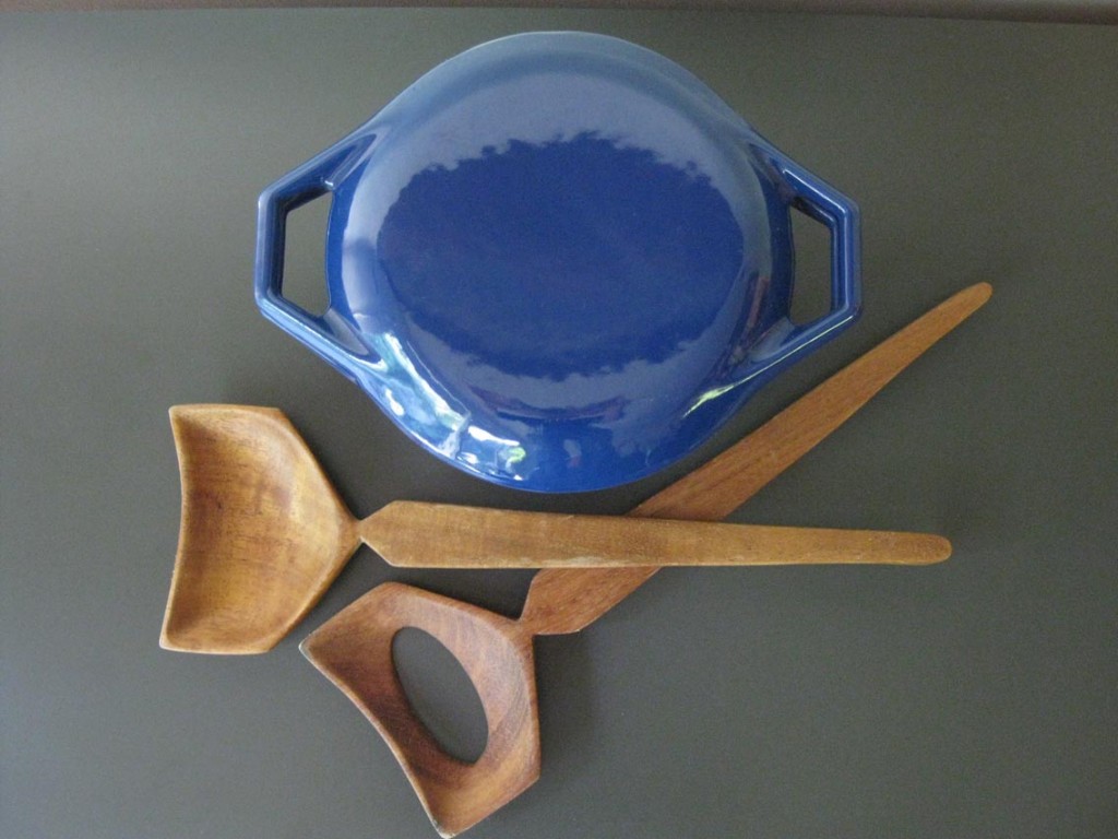
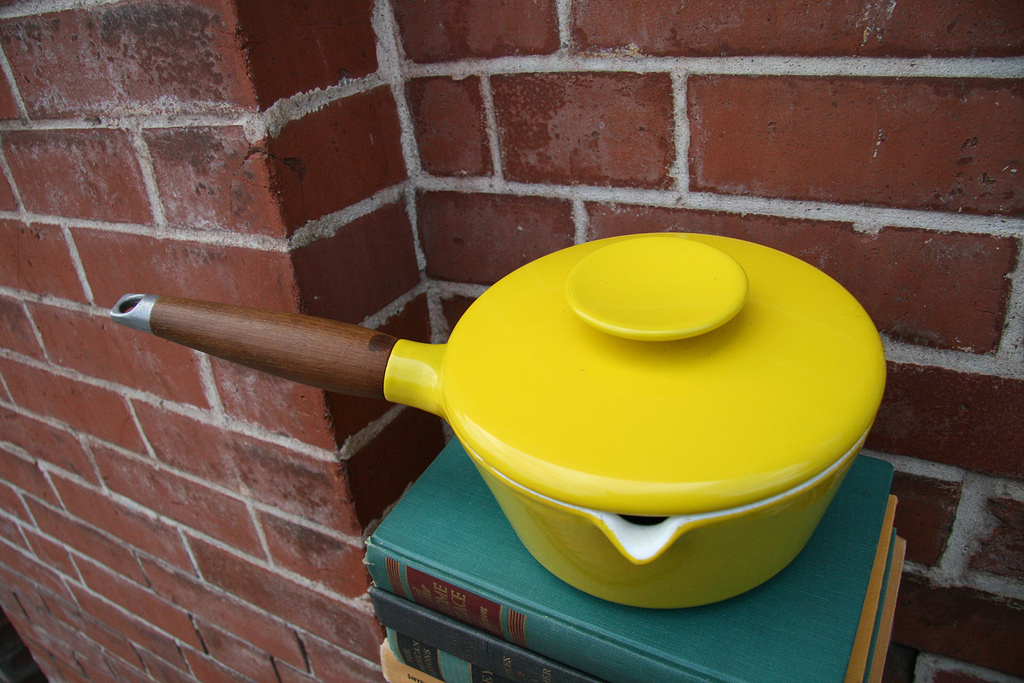
Vintage cast-iron comes in many different shapes and forms.  Yes, there are the very practical solutions like Lodge and other makers of plain cast-iron pots.  Vintage Le Creuset and Descoware are both readily available and reasonably affordable.  But to my mind, the best marriage of function and style has to be Michael Lax for Copco.  Lax started designing enameled cookware for Copco in 1962 and continued through the sixties and seventies.  (He’s also responsible for designing one of my favorite Lightolier lights ever, the Lytegem.)
So what makes his designs stand out for me? Â It’s a blend of form and function. Â Take his dutch oven for instance. Â Even modern-day Le Creuset pots have a plastic knob that will melt if your oven is too hot. Â Not a problem for the Michael Lax dutch oven. It has two sturdy handles and no knobs of which to speak. Â Not only is this design more streamlined over all, it’s perfect for applications requiring a 400 degree oven! Â (It has always bugged me that the standard lid on Le Creuset dutch ovens is plastic and can melt if the oven is turned up too high.)
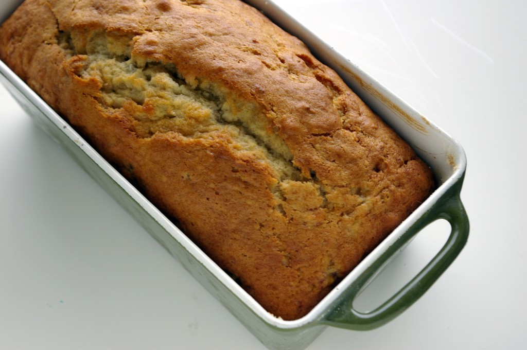
A few months back I purchased a Michael Lax bread pan for making quick breads and the like. Â At first I was worried that the pan wouldn’t work well since it was so heavy, but it’s the best bread pan I’ve ever used! Â After it’s time spent in the oven, even the bottom of my banana bread has a lovely little brown crust. Â I’m telling you folks, I think I’m in love!
Cookbook Round Up!
My birthday was earlier this month and, as always, I received some amazing gifts from Kevin. Â Most of these were food-related, so I wanted to share!
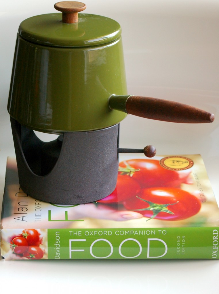
I’ve been wanting the The Oxford Companion to Food (2nd Edition) for a long while. Â It’s one of the best resources for food history and it’s helped me with many of my posts. Â On top of my new tome is my (new to me) Copco fondue pot, designed by Michael Lax. Â I cannot wait to make some fondue in my new pot!
In other (unrelated) news, I’m finishing up the introduction to my dissertation and generally wrapping things up, so posts may be a bit sporadic until I turn in my final draft. Â Thanks, dear readers, for being understanding!
A Few of My Favorite Things: Samphire
Two summers ago, I had samphire for the first time. Â I was a teaching assistant for a Shakespeare course and having a nice dinner in Stratford-upon-Avon and with a fellow T.A. when I bit into an an amazing, salty vegetable. Â My waiter called it samphire, which sounded delightfully exotic. Â Then I remembered watching King Lear the week before and hearing the lines:
Come on, sir; here’s the place: stand still. Â How fearful
And dizzy ’tis, to cast one’s eyes so low!
The crows and choughs that wing the midway air
Show scare so gross as beetles: half way down
Hangs one that gathers samphire, dreadful trade!
Methinks he seems no bigger than his head. (4.6.15-20)
Edgar says these lines to Gloucester as he peers over one of Dover’s cliffs and sees an unlucky man gathering Rock Samphire. Â Thus began my love of samphire!
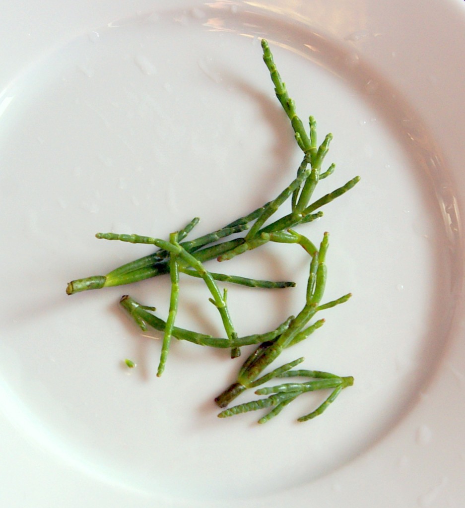
The salty annual you see pictured above is Marsh Samphire, which grows as an annual in marshy regions of the United States and England. Â It’s best to forage samphire during the spring and summer, although I found these at the Ballard Farmer’s Market last weekend. Â In the U.S., samphire is called Sea Beans or Glasswort, but I still call it samphire (a derivation of Saint Pierre, apparently). Â It’s sometimes called Glasswort because it was used in glass-making because it was so salty.
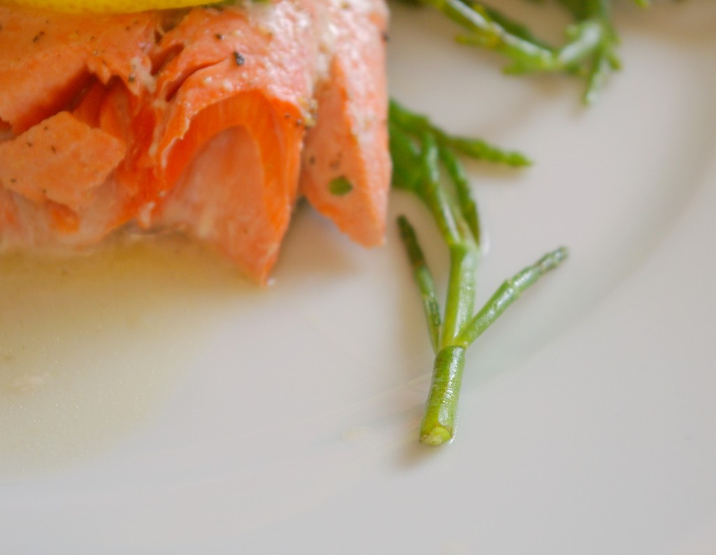
Tonight, I sautéed some salmon and added the samphire for the last few minutes of cooking, just to blanch it.  It’s crunchy, salty, tangy, and a perfect accompaniment to seafood.  It’s gaining popularity right now in the culinary community, and I wouldn’t be surprised if you start to see samphire/sea beans/glasswort showing up under your seafood or pickled, in your bloody mary.  (The most common way to eat samphire in many vintage recipes is to have it pickled.)
Sautéed Samphire with Thyme and Vermouth
1 tbsp. butter
1 tbsp. olive oil
2 tbsp. vermouth
1 tbsp. chopped thyme leaves
3 cups samphire/sea beans/glasswort
salt and pepper to taste
a squeeze of lemon
1. Heat skillet and add butter. Â Stir until melted. Â Add olive oil and vermouth and stir until mixed.
2. Add samphire and thyme. Â Bring liquid to a simmer and cover with lid for 5 minutes.
3. Uncover and add salt, pepper, and a squeeze of lemon juice. Â Stir until samphire is well-coated.
4. Â Serve with seafood!
(I poached my salmon in the butter, olive oil, and vermouth mixture (along with a little water) and then added the samphire for the last 5 minutes!)
Vintage Tablescape Thursday
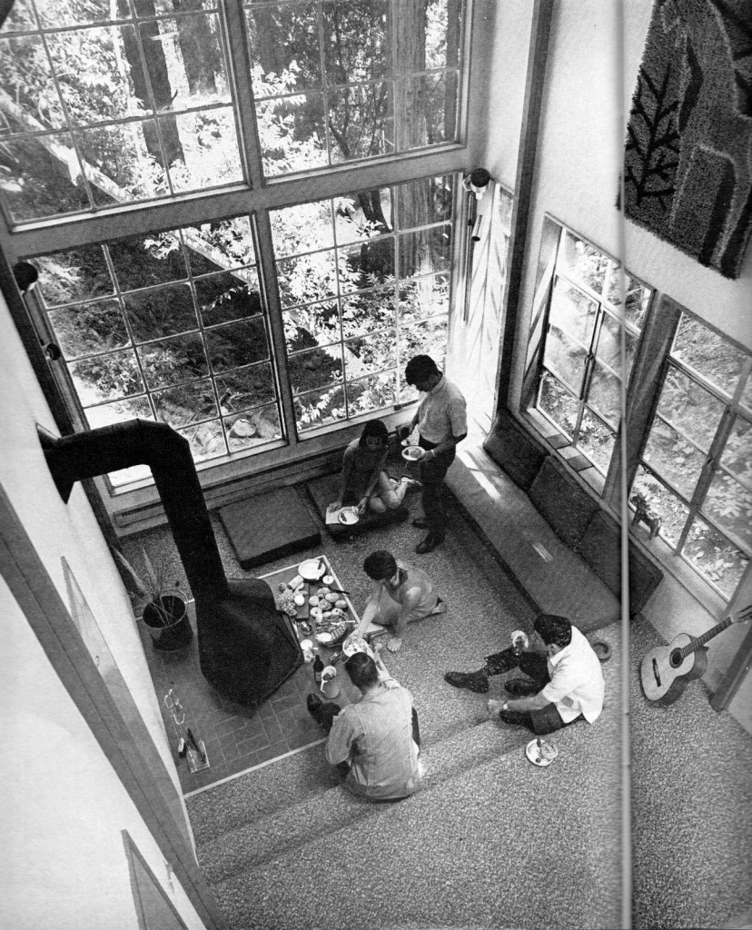
When I file my dissertation I want to spend a week in this house, having cocktails and appetizers by this fire place! Â This amazing tablescape (floorscape?) is from the February 1969 issue of Sunset. The magazine doesn’t say much about where this house is located, other than it’s 25 miles from San Francisco and designed by architects John Arrison and Tajima Fuller.
